


Covington Blue from Benjamin Moore is a classic inviting tone inspired by the documented colors found in 18th- and 19th- century architecture.
Perhaps as a nod to childhood memories of my grandmother's house, I chose to paint the kitchen cabinets of this Nantucket cottage in this wonderful shade of blue.
The honed carrera marble on the countertops and a porcelain farmhouse sink from Whitehaus serve to reinforce the old world feel.
Yellow is a sunny color and generates feeling of happiness and optimism.
Buttery from Pratt & Lambert was the perfect yellow for the walls of this oceanside guest room-not too light and lemony yet not too dark and gold.
To create a "fresh and airy" feel, I used a crisp white on the ceiling and on the iron beds. Printed sheets, incorporating a stronger yellow for contrast as well as two shades of blue, and a handmade rag rug with just a bit of grass green complete the scheme.
For my bedroom in Beacon Hill I used Barista from Benjamin Moore, a wonderfully saturated brown that added a sense of richness to the space.
When using saturated colors, balance is key. In this case, I used simple white nightstands, white lamps with a gold base, and white bed linens with a dark brown trim.
To add a bit of "punch", I placed a collection of Hermes boxes on the shelf of the nightstand and an orange cashmere throw at the foot of the bed.
I love painted floors- checks, stripes, stencils and even spatters such as the floor of this historic boat house in Nantucket.
Deep Ocean from Benjamin Moore provided the perfect base, evoking the depths of the sea just outside the windows. I chose this exquisite shade of rich royal blue as it taps a hint of black to give it even greater depth and dimension.
Notice the way the white cabinetry and mahogany counters "pop" against the colorful floor and the wonderful worn ceiling.
Delaware Putty from Benjamin Moore is a neutral that is as timeless as it is forward. It can be used effectively in traditional as well as contemporary spaces.
It was the perfect choice for the master bedroom in this Nantucket cottage. Notice how well it pairs with warm tones such as the various shades of red and the brown accents to create an envelope that is both traditional and elegant.
The color Pink takes its name from the flowers called "pinks" and is the color most commonly associated with femininity, sensitivity, tenderness, and the romantic.
Nancy's Blush from Farrow and Ball was the perfect backdrop for this bedroom, a sophisticated pink that pairs well with stronger colors.
As a play toward the romantic nature of the color but to avoid an overly feminine scheme, I used a wonderful chinoiserie from Manuel Canovas- blooming with greens, yellow and pinks- and a custom stripe I designed to both reinforce the color scheme and to provide visual contrast.
To create a romantic ambiance for the guest room of this Palm Beach residence, I used Pale Iris from Benjamin Moore. This soft shade of purple exudes the colorful beauty of its namesake flower.
I used a silvery taupe for the carpet and a floral printed silk for the window treatment to balance the color palette and add some sophistication. The mirrored pieces serve to visually unite all of the elements for a harmonious effect.
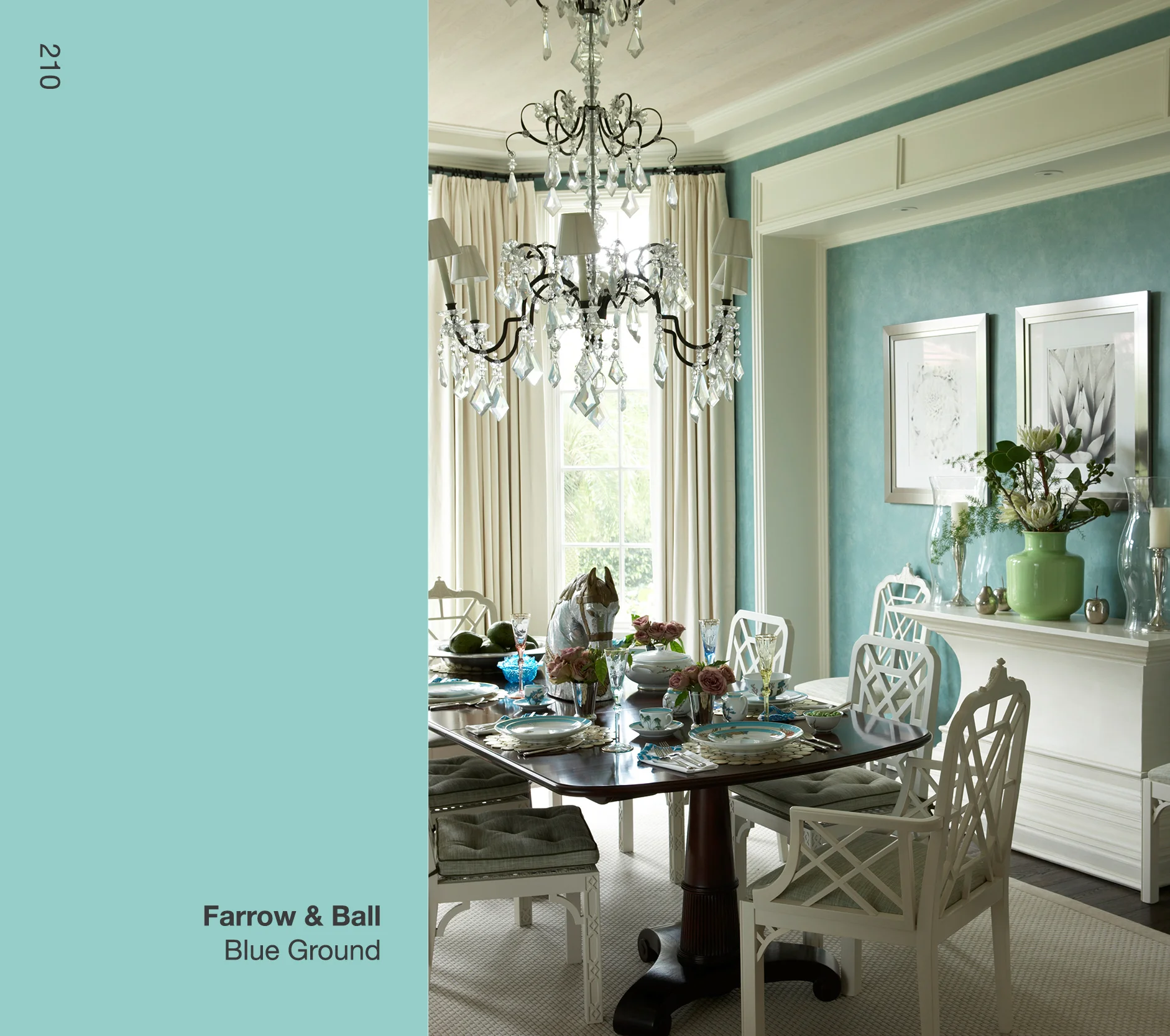
Blue Ground from Farrow & Ball is a light turquoise that radiates peace, calm and tranquility. It also has a "coolness" which can be a relief in tropical environments such as this dining room in Palm Beach.
To create some balance in the color scheme, I paired Blue Ground with white as seen in the draperies and the moldings which seem to frame the space.
For visual interest, I focused on the Chippendale chairs and painted them a slightly brighter white than the moldings. When placed around the dark mahogany table, they really came to life. The sparkling crystal chandelier from Dennis & Leen adds a final touch of elegance.
I like to use the color Red to warm up a room. Red Parrot from Benjamin Moore was perfect for this master bath in an urban townhouse. I particularly liked the contrast with the cool Calacutta marble and the white Empire soaking tub from Waterworks.
Red Parrot is a particular favorite of mine because the claret undertone softens what can be percieved as a strong color.
It is no secret that Orange is my favorite color! It inspires me both mentally and emotionally and helps to keep my creative fires burning brightly.
I used Tangelo from Pratt & Lambert on the walls of this dining room in Boston's Back Bay to help ensure energetic, lively conversation at the stately antique mahogany table.
When using stronger colors I like to create balance through juxtaposition. Notice the pairing of the traditional sideboard with a fantasy landscape painting by American artist Scott Prior. The strength of the green grass and the dinosaur in the artwork both makes a statement and provides the desired offset to this wonderful citrusy orange.